
Some websites are designed Adaptive, where their layouts are static and relative to different device types (desktop, tablet, and mobile devices). And there is another kind, called Responsive websites that dynamically adapt their layouts correspondingly to different screen sizes and viewports. This way, they appear uniform across all devices. In either case, you often run a VWO test campaign across multiple devices. But occasionally, you might require running a campaign aimed at a definite device type.
Let’s say your website is diagnosed with a lower conversion rate on mobile. In an effort to improve the conversion rate, you plan to give a special offer for the visitors that access your mobile website. To cater to such purposes, VWO provides you with the ability to run device-specific test campaigns, along with targeting the corresponding visitor groups.
But not just that, how about working on your campaign pages, while still previewing them? VWO has it covered too. VWO Editor simulates your pages corresponding to the device, on which you choose to view the modifications - making it handier to apply changes appropriately. You can also set the size of the device screen or choose from the available predefined set of resolutions, as applicable for some of the widely used mobile and tablet devices.
Feel like trying it? Then gear up, let’s dig in more into these features by creating an A/B Test campaign for your website.
Setting up Test URLs, Configuring Devices, and Segmenting Visitors
If you are familiar with the steps to create an A/B test campaign, you know the drill.
Navigate from the left pane to Testing > A/B and click Create.
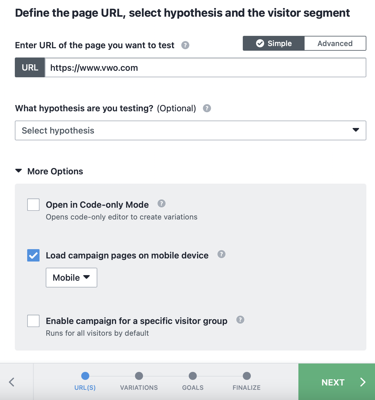
Post specifying the URL that you want to modify and test, you can specify the device on which you want to load your campaign pages inside the VWO Editor and also target a specific group of visitors that can see your campaign.
You can accomplish these configurations via the following options in the More Options section:
- Load campaign pages on mobile device - If you are to run your campaign for devices other than desktop, enable this option and choose a device type from the dropdown that appears below it. This will load the campaign URL inside the editor in the corresponding simulated view so that you can design your variations, accordingly.
All the same, configuring this option doesn’t restrict your choices for other device types. If you have chosen the option as Mobile here, you can still switch the view to desktop or tablet within the editor. Plus, you also get to choose amongst the available mobile interface options to load the required mobile and tablet views.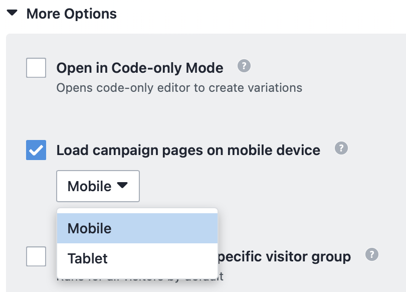
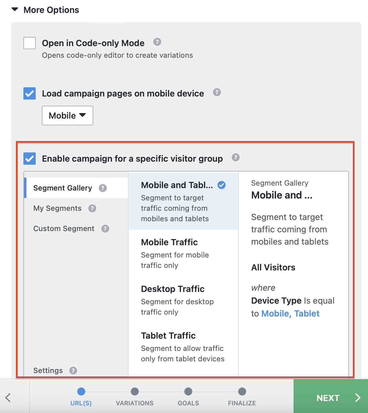
NOTE: This option is only to load your campaign URL in the corresponding view. It does not warrant the applicability of your changes specifically to the intended device types. To keep the changes specific to the device type, use the Applicability of Modifications option in the Editor settings. - Enable campaign for a specific visitor group - Defining the device type and configuring the applicability of your modifications wouldn’t serve the purpose enough until you target the right audience for your test campaign. Else, the test spans for all visitors by default and your results will only be as appropriate as your audience. Furthermore, your visitor quota gets consumed beyond the scope.
This option allows you to define the group of visitors, only to whom the campaign is to be displayed. You can use this to target the visitors that arrive at the campaign URL via a specific device(s). Enable this option and select the appropriate device-based segment condition from the Segment Gallery. You can choose from one of the following segment conditions to suit your purpose:
-
- Desktop Traffic
- Mobile Traffic
- Tablet Traffic
- Mobile and Tablet Traffic
- Desktop and Tablet Traffic
-
After configuring these, proceed into modifying your webpage(s) using VWO Editor by clicking NEXT.
Configuring Website Changes
Within VWO Editor, you don’t just get to create variations. Here’s also where you can avail the complete control over the view of your website on individual devices and the applicability of the changes you make to your website to definite device types.
Applying device-specific variations
When you create variations in the VWO Editor, the changes are applied across all device types, by default. However, this can be controlled such that the changes are custom-applied to each device. This comes in handy when you are looking to run a campaign with variations specific to different devices.
Let’s say that you want to run a campaign, where you want to display a custom offer banner whose design, layout and positioning differs for the audience of each device type. You can do this by applying the changes specific to each device type within the VWO Editor, as described in the following steps:
- Inside the VWO Editor, click the SETTINGS option from the bottom panel.

- In the Editor Settings dialog that appears, go to Applicability of modifications and select Specific to each device. This option allows you to keep the changes specific to each device. To know more about this option, refer to this article.
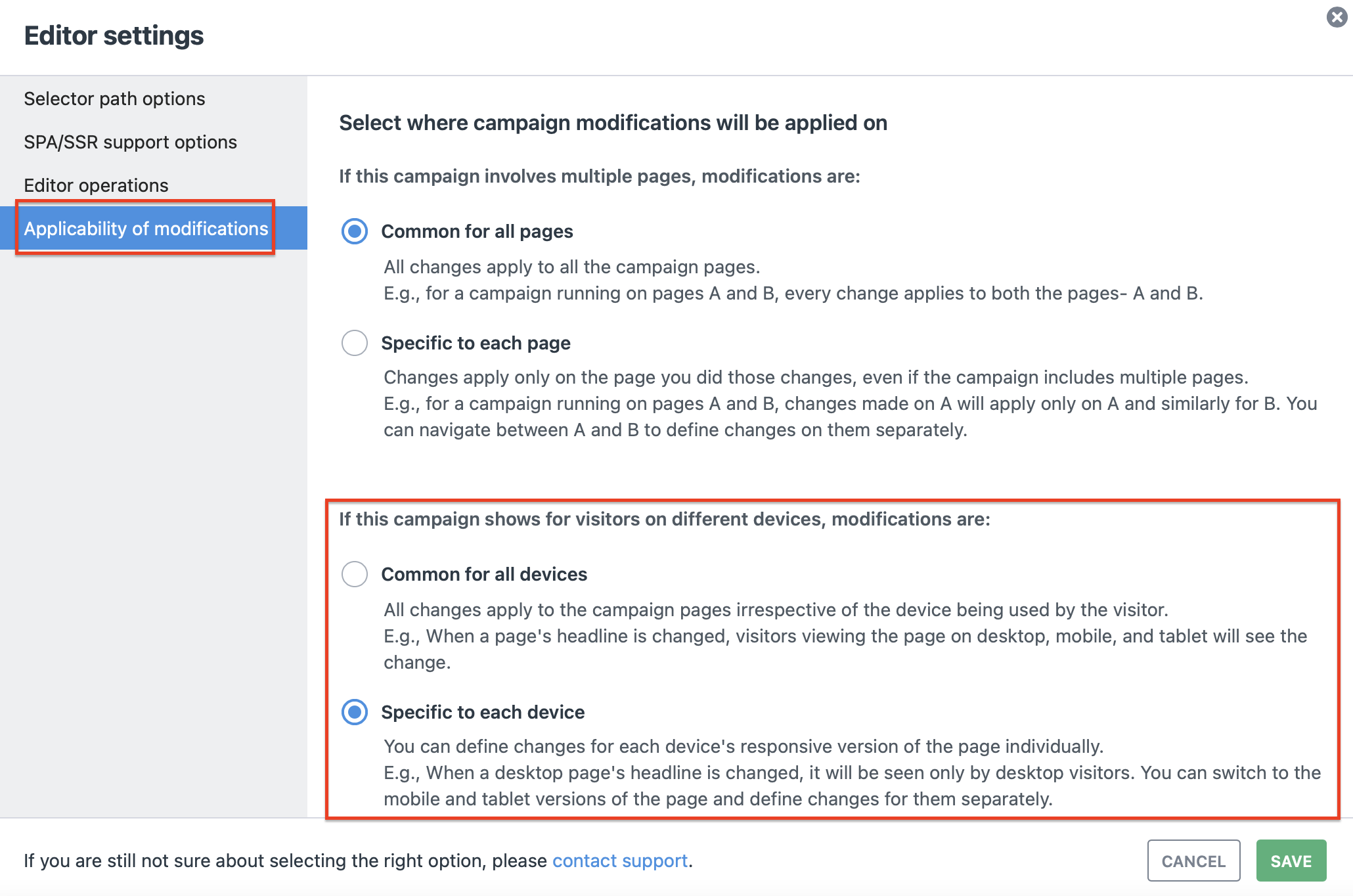
- Post configuring, click SAVE.
The Mobile Interface Options
Had you configured the device type while defining the test URL, VWO Editor simultaneously loads the webpage, in the corresponding view. To switch the view to another device type, access the Device Type option from the bottom panel of the editor (as shown in the image below).
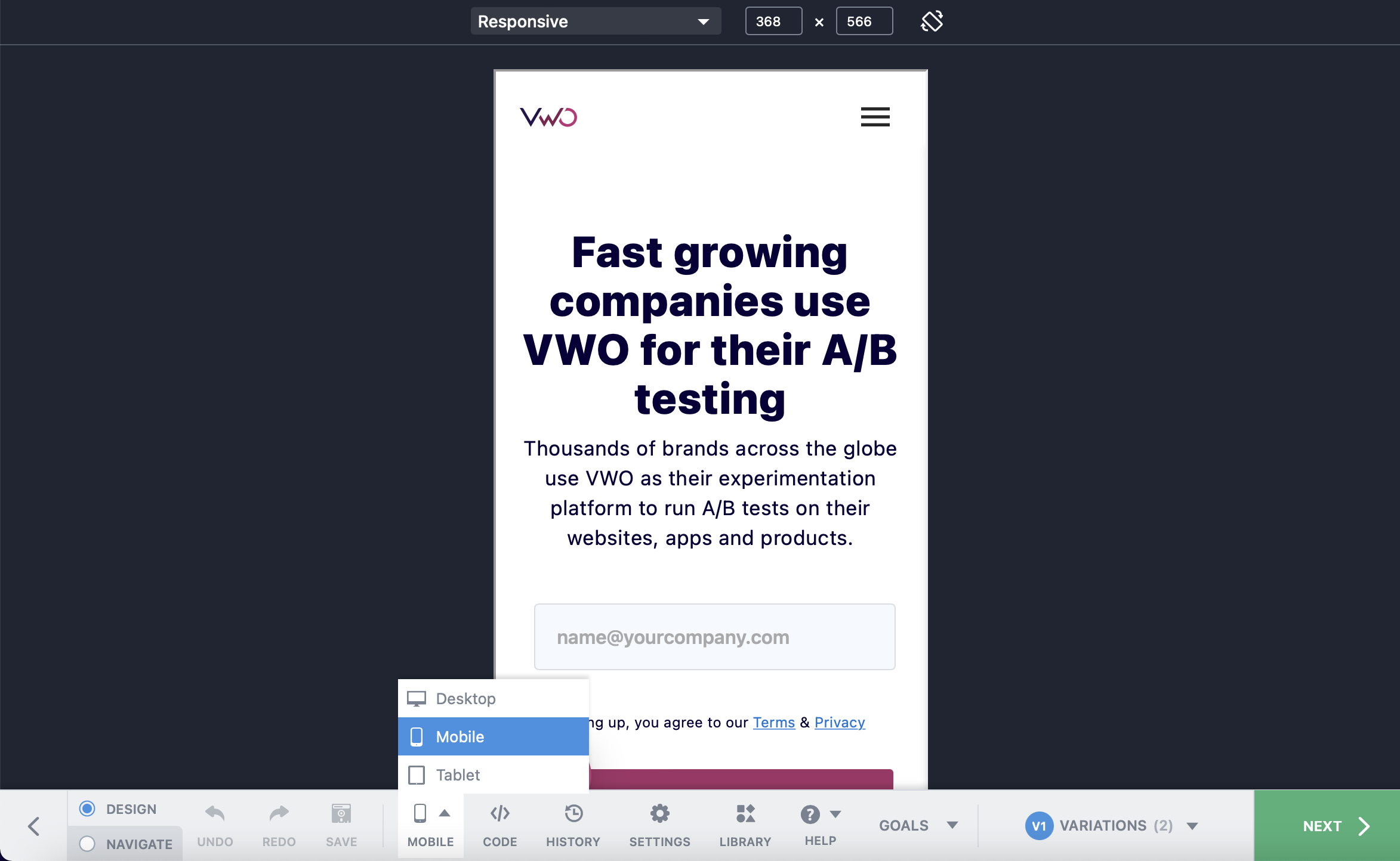
While the Desktop option loads the campaign pages in the regular desktop view, the Mobile and Tablet options allow you to either define the resolution or select from the list of predefined resolutions for the webpage, as applicable to the corresponding device types. This is available in the top panel, where you can also avail the option to toggle the view between portrait and landscape.
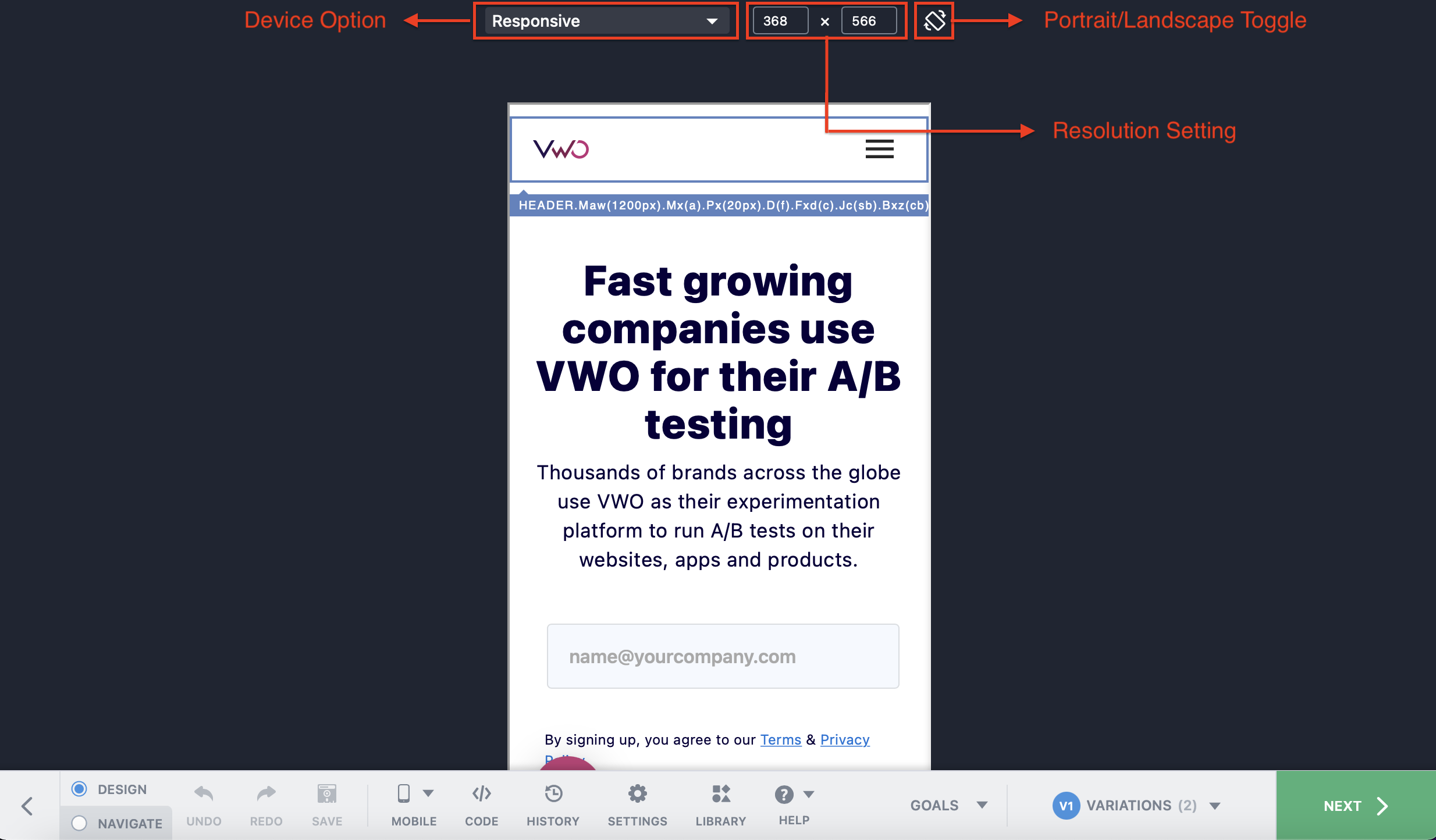
To custom define the resolution for your webpage, use the Responsive mode that is available for both Mobile and Tablet options.
To use the predefined resolutions for a Mobile device, you can choose one from the following device options:
| Device Option | Resolution (Portrait) |
| Moto G4 | 360 x 640 |
| Galaxy S20/S21 | 360 x 800 |
| iPhone 5/SE | 320 x 568 |
| iPhone X/12/13 Mini | 375 x 812 |
| iPhone 12/12 Pro/13/13 Pro | 390 x 844 |
| iPhone 12/13 ProMax | 428 x 926 |
For a Tablet device, you can choose from the following device options:
| Device Option | Resolution (Portrait) |
| Ipad/Ipad Mini | 768 x 1024 |
| Ipad Pro | 1024 x 1366 |
| Galaxy | 1200 x 2000 |
Once you have created your variations, click SAVE AND CONTINUE to proceed further into setting up the A/B Test campaign as described in this article.